Art of the Flower and Garden 2014

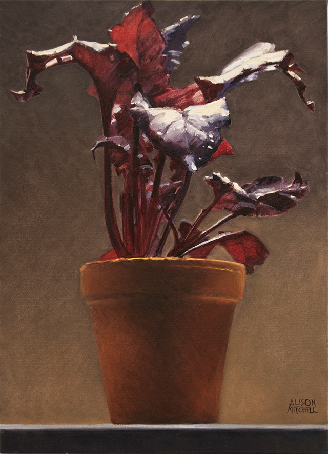
Winner Traditional Category – Alison Mitchell – Bull’s Blood – Seedling – Oil on canvas – $2800

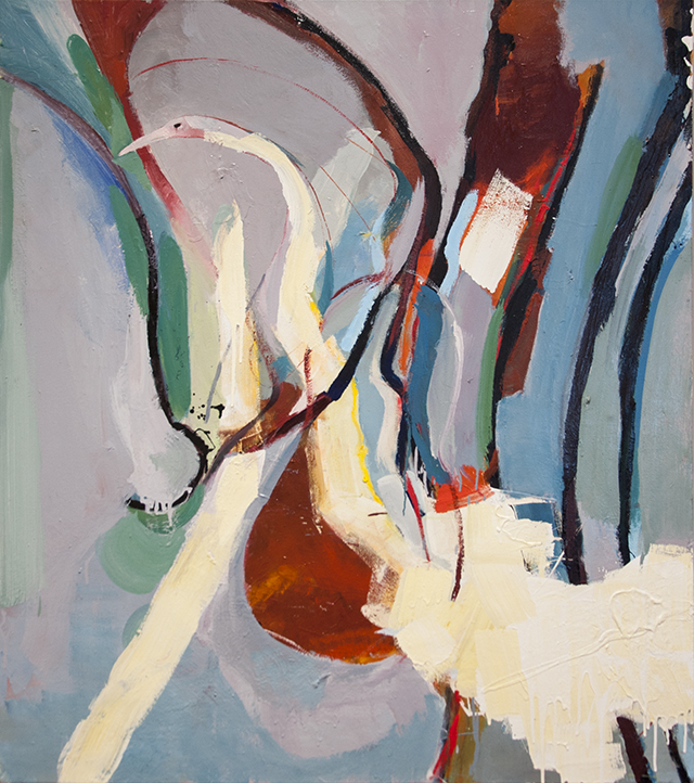
Winner Alternative Category – Timothy Dell – Django amongst the birds – Oil on canvas – $1100
A WALK AROUND THE GALLERY WITH CARMINE AND BJ
Having the two categories – traditional and alternative – presents a judging challenge for works that could belong in either category.
As most of the work submitted is traditional, having an alternative prize represents a good opportunity for those entering this category: something for artists to consider in future.
Some picks, starting with Adelaide Botanical Art Group in the Annex:
Joanne Knott, “Swainsonia formosa”:
Moving away from the traditional botanical format, its edge to edge work and strong rhythms with branchy repetitions are a delight. The finesse of detail and delicacy of touch shows a “slice” of nature. There’s a lot going on.
Elizabeth Anne Mitchell, “Eucalyptus kingsmilii”:
Great design and colour with attractive repetition of shapes in the twigs and fruit. This is a work of character with depth of detail and fidelity.
In “Ficus carica” surface and interior of fruit and treatment of leaf texture demonstrate the “essence” of fig.
Sandra Johnston, “Eucalyptus”:
A simple subject with rich detail and surface description – visually satisfylng.
Rosslyn Walker, “Eucapyptus grossa”:
Good use of negative space, and the work has clarity and simplicity. The branches are handled beautifully.
Trish Cooper, “Eggplant and Chillies”, “Eggplant and Radishes”, and “Red Red Pomegranates”:
Satisfying and voluptuous forms, the shine on the vegetables beautifully captured, richly coloured and robust. Framing note: work is let down by unrelated, unevenly spaced mats without proper bevelled aperture. Keep going with work like “Scotch Thistle”.
Heather Cunningham, “Lavender Flower”, “Aubergine” and “Violets”:
Care and fidelity show in these pleasing works. Framing note: the use of a strongly coloured inner mat between the white outer mat and white paper is distracting, tends to draw the eye away from the work.
Silja Zarins “Iris germanica”, “Sun Orchid” and “Freesias”:
The simple frame and mats enhance the works without drawing attention. Even though fine in detail, these are strong works of restrained richness and intensity of colour and contrast. Beautifully defined and tonally strong.
Catherine Veide “Iochroma cyaneum” and “Narcissus Tete a Tete”:
Subtle work, with fine handling of detail and satisfying on close inspection.
In the corridor –
Glenys Christopher: There’s an oriental feel about some of these works, especially “The Garden that Grew”. Needs to clarify and simplify – less is more – take away some of the distracting elements and bring out the highlights to strengthen the tonal design.
Julie Morris: “After the Rain” a monochromatic work with great unity of purpose. A simple subject and bold idea beautifully presented with shadow mounting and no colour to distract.
Moira Lee, “Iris”: Would like to see this bigger. A dark work with pale mat is distracting – it needs a medium tone mat to show the subdued colouration to best advantage. The abstract design is good with a nice simplification of the form and close up cropped “edge tension” What’s been left out is as important as what’s been left in.
It has that classic oriental thing – object cropped by borders so moves beyond the edge of the picture with negative shapes echoing the positive.
Heather Parker, “Grace / God’s Garden”:
Good framing and composition with vertical format and beautiful mirroring of branches and water area. This work shows a truth to materials and captures the essence of form. A restrained use of colour and idea expressed through simple means and understatement. Not edge shy (not restrained by edges – you know it continues beyond the frame). Abstraction of unnecessary detail yet fine detail where needed gives it its focus. Calm, meditative.
The Bence Room…
Maxine Donald: Great delicacy of handling.
Carol Griffiths, “Protea 2”: Crisp strong graphics.
Linda Stanway, “In my Garden”: The apparent topical political narrative is an unusual interpretation of theme.
Rae Gierke, mosaic: Stepping outside the materials boundary, nice to see.
Susan McGillivray: Good to see the 3D work.
…and into the Main Gallery.
Elizabeth Collins “Sturt Desert Pea”:
Good pastel painting and satisfying scale (the only artist who has expanded scale).
Roslyn Batten: Impressionistic texture, vibrating colour, but shy of tonal contrast.
Louise Gerard & Kerry Youde “Aurora Sleeps”. SPECIAL MENTION.
Suspended Tutu, collaborative work.
Wearable, 3D artwork, good to see Costume Art in this setting
Unusual interpretation of theme, but very apt
Nice suspension in space, like a nodding flowerhead,
Sits in space where it would when worn
Would take on another dimension in performance
Timothy Dell “Django Amongst the Birds”. CONTEMPORARY WINNER:
Dynamic abstract design, with good rhythm of repeated forms
Figurative elements, but not at the expense of the abstract design
Controlled use of the accidental mark, bold texture of paint and brush
Small areas of intense contrast against fields of close harmonies
Impact through scale
Chris Alway, “Apricot and Touches of Violet”:
An experimental use of watercolour, fresh and dynamic. Good division of space with verticals and horizontals and implied horizon. Repeated rhythmic verticals lead and focus the eye into the implied distance. Colour use – warm tones with touches of gold and turquoise.
Alison Mitchell, “Bull’s Blood – Seedling”. TRADITIONAL WINNER:
Strong abstract design while still representational
Restrained colour palette with bold clear shapes, great tonal contrast
Bold, confident paint handling
Beautiful, rhythmic repeated forms
Portrait-like: reminiscent of a Rembrandt with transparent shadows, opaque highlights
‘Monumental’ perspective due to the low vantage point
Colleen Morrow, “Poppies, Persimmons and Pomegranates” (reduction lino print):
Great colour, texture and form, with strong graphic qualities.
MERIT AWARDS: Joanne Knott, Elizabeth Anne Bishop, Sandra Johnston, Colleen Morrow, Julie Morris, Heather Parker, Rosslyn Walker and Chris Alway.
Notes on Merit Awards
The high standard of work in general made the decision on merit awards quite difficult.
Some artists who received a merit award had other works equally worthy of selection.
Quite a few artists, with work of a high standard, only missed out by a hair’s breadth.